
Elegant Custom UIViewController Transitions
If you’ve ever implemented a custom view controller transition by adopting UIViewControllerTransitioningDelegate and UIViewControllerContextTransitioning in your view controller, you may have found that the result added unwelcome clutter to your view controller and wasn’t very reusable. This tutorial will show you how to build a reusable, standalone view controller transition by subclassing UIStoryboardSegue. You’ll see how the segue conveniently integrates with Interface Builder as a custom segue type and can be used in any UIKit app — no storyboard required.
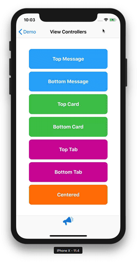
The image above shows this technique in action in the SwiftMessages demo app. The transitions you see where done using a custom segue that I introduced in SwiftMessages 5 to utilize SwiftMessages layouts, animations, and more for modal view controller presentation and dismissal.
For this tutorial, we’re going to reproduce the bottom card-style transition. To keep it simple, some of the non-essential functionality, like background dimming and dismissal gestures, will be left to you as an exercise.
The full source of the final project can be found on our CustomSegueDemo GitHub repo. Let’s get started.
Step 1: Create a custom segue.
Start by creating a subclass of UIStoryboardSegue called BottomCardSegue.
class BottomCardSegue: UIStoryboardSegue {
    override func perform() {
        source.present(destination, animated: true, completion: nil)
    }
}
The segue’s action happens inperform(), which we override and do a modal presentation.
source.present(destination, animated: true, completion: nil)At this stage, BottomCardSegue is already a fully-functional custom segue. It just doesn’t do anything interesting yet.
Step 2: Set up the storyboard.
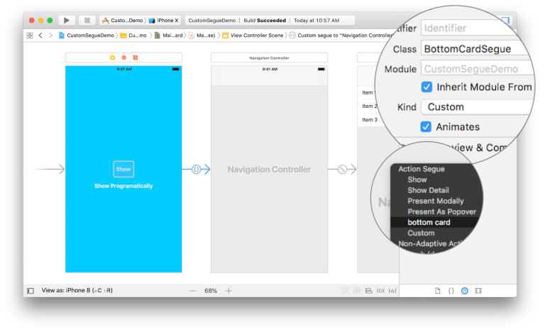
Taking a look at main.storyboard, the initial view controller consists of a “Show” and “Show Programmatically” buttons. The destination view controller is a simple navigation stack (copied directly from the SwiftMessages demo app). We define our storyboard segue (highlighted blue) using the standard procedure:
- Control-drag from “Show” to the navigation controller.
- Select “bottom card” from the segue type prompt.
Interface Builder has conveniently included BottomCardSegue in the segue type prompt using the autogenerated (and oddly lower-cased) name “bottom card”.
Step 3: Prepare for segue.
Next, we add a “Done” button to the root view controller. I would normally recommend having the “Done” button trigger an unwind segue. However, in order to point out that a custom segue experiences the same lifecycle as a built-in segue, we’ll add the button and configure its action in prepare(for:sender:).
class ViewController: UIViewController {
    override func prepare(for segue: UIStoryboardSegue, sender: Any?) {
        let navigationVC = segue.destination as! UINavigationController
        let rootVC = navigationVC.viewControllers.first!
        let doneButton = UIBarButtonItem(barButtonSystemItem: .done, target: self, action: #selector(hide))
        rootVC.navigationItem.rightBarButtonItem = doneButton
    }

     @objc private func hide() {
        dismiss(animated: true, completion: nil)
    }
}
The dismissal action is done in the hide() function by calling dismiss(animated:completion:).
dismiss(animated: true, completion: nil)You can now run the app to verify that “Show” and “Done” are working. What you’ll see is the default full-screen modal transition — the one that slides up and down from the bottom.
Configuration Options
Suppose that we added an option to BottomCardSegue to specify whether or not to dim the background. In an ideal world, Interface Builder would support @IBInspectable on UIStoryboardSegue, allowing us to set the dim option directly on the segue’s Attribute Inspector panel. Alas, this is not the world we live in, so I’ll suggest a couple of for configuring segues.
- Subclass
BottomCardSegueand configure options ininit(identifier:source:destination:). For example, we could defineBottomCardDimmedSeguewith the hypothetical background dimming option enabled. Interface Builder would add a “bottom card dimmed” option to the segue selection prompt. - Downcast
segueinprepare(for:sender:)toBottomCardSegueand configure options there.
While you’re considering which path to take, ask Apple to support @IBInspectable on UIStoryboardSegue!
Step 4: Add the custom transition.
We’re ready to add the custom transition by having BottomCardSegue adopt UIViewControllerTransitioningDelegate and UIViewControllerContextTransitioning. We need to add a few more steps to perform() before calling present().
class BottomCardSegue: UIStoryboardSegue {

    private var selfRetainer: BottomCardSegue? = nil

    override func perform() {
        destination.transitioningDelegate = self
        selfRetainer = self
        destination.modalPresentationStyle = .overCurrentContext
        source.present(destination, animated: true, completion: nil)
    }
}
First, set the destination view controller’s transitioning delegate to self to gain control over the transition.
destination.transitioningDelegate = selfUIKit doesn’t automatically retain instances of UIStoryboardSegue. Therefore, in order to stay around long enough to perform the dismissal transition, we need to create a strong reference to self. We’ll set it to nil after dismissal to avoid leaking memory.
private var selfRetainer: BottomCardSegue? = nil

override func perform() {
    ...
    selfRetainer = self
    ...
}
Finally, we set the modal presentation style to .overCurrentContext to allow the presenting view controller to remain visible under the presented content.
destination.modalPresentationStyle = .overCurrentContextOur job as transitioning delegate is to vend the instances of UIViewControllerAnimatedTransitioning that perform the actual presentation and dismissal animations. In a moment, we’ll introduce nested classes Presenter and Dismisser and have each of them adopt UIViewControllerAnimatedTransitioning. But first, let’s adopt UIViewControllerTransitioningDelegate on BottomCardSegue by returning Presenter and Dismisser instances when asked.
extension BottomCardSegue: UIViewControllerTransitioningDelegate {
    public func animationController(forPresented presented: UIViewController, presenting: UIViewController, source: UIViewController) -> UIViewControllerAnimatedTransitioning? {
        return Presenter()
    }

    public func animationController(forDismissed dismissed: UIViewController) -> UIViewControllerAnimatedTransitioning? {
        selfRetainer = nil
        return Dismisser()
    }
}
The segue’s final task is to vend the dismissal component. So we are free to release the strong self reference just before returning Dismisser().
selfRetainer = nilThe Presenter and Dismisser classes adopt UIViewControllerTransitioningDelegate as follows.
private class Presenter: NSObject, UIViewControllerAnimatedTransitioning {

    func transitionDuration(using transitionContext: UIViewControllerContextTransitioning?) -> TimeInterval {
        return 0.5
    }

    func animateTransition(using transitionContext: UIViewControllerContextTransitioning) {
        let container = transitionContext.containerView
        let toView = transitionContext.view(forKey: .to)!
        let toViewController = transitionContext.viewController(forKey: .to)!
        // Configure the layout
        do {
            toView.translatesAutoresizingMaskIntoConstraints = false
            container.addSubview(toView)
            // Specify a minimum 20pt bottom margin
            let bottom = max(20 - toView.safeAreaInsets.bottom, 0)
            container.safeAreaLayoutGuide.bottomAnchor.constraint(equalTo: toView.bottomAnchor, constant: bottom).isActive = true
            container.safeAreaLayoutGuide.leadingAnchor.constraint(equalTo: toView.leadingAnchor, constant: -20).isActive = true
            container.safeAreaLayoutGuide.trailingAnchor.constraint(equalTo: toView.trailingAnchor, constant: 20).isActive = true
            // Respect `toViewController.preferredContentSize.height` if non-zero.
            if toViewController.preferredContentSize.height > 0 {
                toView.heightAnchor.constraint(equalToConstant: toViewController.preferredContentSize.height).isActive = true
            }
        }
        // Apply some styling
        do {
            toView.layer.masksToBounds = true
            toView.layer.cornerRadius = 20
        }
        // Perform the animation
        do {
            container.layoutIfNeeded()
            let originalOriginY = toView.frame.origin.y
            toView.frame.origin.y += container.frame.height - toView.frame.minY
            UIView.animate(withDuration: 0.5, delay: 0, usingSpringWithDamping: 0.8, initialSpringVelocity: 0, options: [], animations: {
                toView.frame.origin.y = originalOriginY
            }) { (completed) in
                transitionContext.completeTransition(completed)
            }
        }
    }
}

private class Dismisser: NSObject, UIViewControllerAnimatedTransitioning {

    func transitionDuration(using transitionContext: UIViewControllerContextTransitioning?) -> TimeInterval {
        return 0.2
    }

    func animateTransition(using transitionContext: UIViewControllerContextTransitioning) {
        let container = transitionContext.containerView
        let fromView = transitionContext.view(forKey: .from)!
        UIView.animate(withDuration: 0.2, animations: {
            fromView.frame.origin.y += container.frame.height - fromView.frame.minY
        }) { (completed) in
            transitionContext.completeTransition(completed)
        }
    }
}
We won’t step through the above layout and animation code in detail because transition mechanics are not the focus of this tutorial. Many existing resources do a great job covering UIViewControllerAnimatedTransitioning (try Apple’s documentation, AppCoda, or objc.io).
However, it’s worth noting one layout detail found in Presenter. When setting up the Auto Layout constraints on toView, we respect the view controller’s preferredContentSize.height property by adding an explicit height constraint if preferredContentSize.height >= 0.
if toViewController.preferredContentSize.height > 0 {
    toView.heightAnchor.constraint(equalToConstant: toViewController.preferredContentSize.height).isActive = true
}
No height is specified when preferredContentSize.height == 0 (the default). Instead, Auto Layout is left to work out toView‘s height based on its constraints.
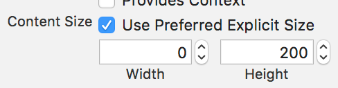
A word of caution about UINavigationController. In our testing, the intrinsic height of a navigation controller does not reflect the Auto Layout constraints of its content. It is therefore necessary to specify a value for preferredContentSize.height. Without it, our navigation stack would have zero height. So let’s specify 200pt in the navigation controller’s Attribute Inspector panel in main.storyboard.
With that out of the way, we’re done! We now have a reusable UIStoryboardSegue subclass that utilizes custom view controller transitioning APIs to present a modal view controller using a card-style layout. Try it out.
Programmatic Transitioning
We’ll conclude by showing how apps that don’t use storyboards can use BottomCardSegue. For simplicity, we’re going to use the view controllers in main.storyboard. The important point is that the transition will be performed programmatically without an associated segue in the storyboard itself.
To set this up, we introduce an @IBAction in the main view controller and connect it to the “Show Programmatically” button.
@IBAction func showProgrammatically(_ sender: Any) {
    let childVC = storyboard!.instantiateViewController(withIdentifier: "Child")
    let segue = BottomCardSegue(identifier: nil, source: self, destination: childVC)
    prepare(for: segue, sender: nil)
    segue.perform()
}
Instantiate the destination view controller.
let childVC = storyboard!.instantiateViewController(withIdentifier: "Child")Use this to initialize BottomCardSegue.
let segue = BottomCardSegue(identifier: nil, source: self, destination: childVC)prepare(for: segue, sender: nil)Call prepare(for:sender:) to configure the “Done” button. I don’t advocate calling this in general, but UIKit doesn’t seem to mind.
Finally, perform the segue.
segue.perform()Cool!
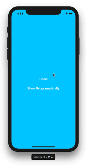
Here’s what the final result looks like.
Custom UIViewController transitions can be a great way make your app unique and enjoyable. We hope this tutorial has inspired you to give it a try. Thanks for reading and happy coding.
Everything you need to grow your business
Crafting exceptional mobile experiences so you stand out in a crowded digital landscape. Trusted by Experian, Vrbo, & Expedia.
Let's do it together